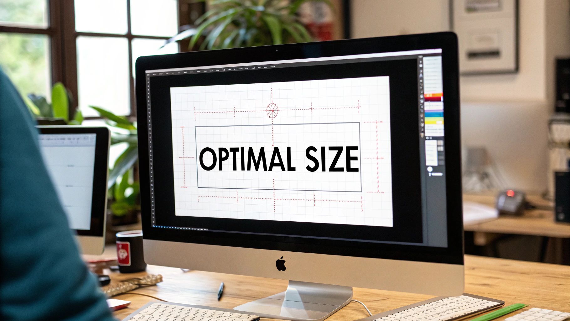
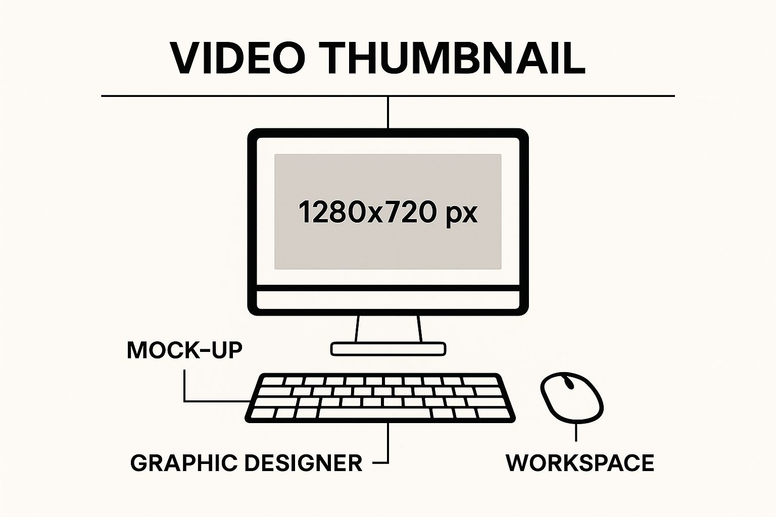
Let's get right to it. The magic number you're looking for is 1280 x 720 pixels. That’s the ideal size for a YouTube thumbnail. Think of it as the universal key that unlocks a perfect, crisp look for your video's "cover art," no matter if you're an educator sharing a lecture on a smart TV or a researcher whose work is being viewed on a tiny phone screen.
The Perfect YouTube Thumbnail Size and Why It Matters
Your thumbnail isn't just a placeholder; it's the single most important piece of advertising for your video. For creators, educators, and researchers, it’s the first impression—the visual handshake that convinces a potential viewer to click. Nailing the technical specs is the foundation for a higher click-through rate (CTR) and signals the quality of your content before anyone even hits play.
Why 1280 x 720 pixels specifically? It’s all about the 16:9 aspect ratio. This ratio perfectly mirrors the shape of the standard YouTube video player, creating a seamless and professional look. Get this right, and you'll avoid those ugly black bars or stretched-out images that can undermine your credibility.
Key Technical Specifications
Beyond just the resolution, YouTube has a few other ground rules you need to follow. These aren't arbitrary; they're designed to ensure your thumbnail uploads correctly and loads fast for everyone, everywhere.
- Resolution: Stick to 1280 x 720 pixels. While the minimum width is 640 pixels, using the full resolution ensures your image is sharp and detailed.
- Aspect Ratio: Always 16:9. This is non-negotiable for perfect alignment with the YouTube player.
- File Formats: You’ve got options here. JPG, GIF, or PNG are all accepted.
- File Size: Keep it lean. Your file must be under the 2MB limit.
This simple graphic is a great reminder of the one number to remember for your design workflow.
Here's a quick reference table to keep all those technical details straight. I recommend bookmarking this page—it’s a lifesaver when you’re deep in your creative process.
YouTube Thumbnail Quick Reference Guide
| Specification | Recommendation | Why It's Important |
|---|---|---|
| Resolution | 1280 x 720 pixels | Ensures your thumbnail is high-quality and looks sharp on all screens, from mobile to TV. |
| Aspect Ratio | 16:9 | Perfectly matches the YouTube player, preventing black bars or awkward cropping. |
| File Formats | JPG, PNG, GIF | These are the standard formats accepted by YouTube for easy uploading. |
| File Size | Under 2MB | Guarantees your thumbnail loads quickly, providing a better experience for viewers with slower connections. |
| Minimum Width | 640 pixels | An absolute minimum requirement for YouTube to accept the upload. |
Following these guidelines isn't just about pleasing the YouTube algorithm; it's about creating a better, more professional experience for your audience. It’s a small detail that makes a huge difference. You can learn more about these guidelines and their importance straight from YouTube’s official help center.
Mastering File Size and Format Requirements
While pixel dimensions get most of the glory, the file size and format of your thumbnail are just as critical. Let’s be real—a perfect size for a YouTube thumbnail isn’t just about how it looks; it’s about how it loads. Think of it this way: a stunning, high-res image is completely useless if it takes too long for a viewer's device to actually display it.
That's precisely why YouTube put a strict 2MB file size limit in place. This rule is non-negotiable, and it’s there to make sure your video's "front door" appears instantly for everyone—whether they're on a blazing-fast fiber connection or a spotty mobile network. An oversized file can kill your page load time, and that's often all it takes for an impatient viewer to scroll right past. You can dig deeper into these performance-focused guidelines in various industry reports, like this one about best practices on Promo.com.
Choosing the Right File Format
YouTube gives you three main options for your thumbnail's file format: JPG, PNG, and GIF. Each has its own job to do, and picking the right one can make a huge difference in your thumbnail’s quality and final file size.
-
JPG (JPEG): This is your workhorse for any thumbnail with photographic elements. JPGs are brilliant at compressing complex images full of colors and gradients—like a shot of a person or a landscape. That compression is key to easily staying under the 2MB limit without a noticeable nosedive in visual quality.
-
PNG: Reach for PNG when your thumbnail is heavy on graphics, text, or logos. This format keeps sharp lines and text perfectly crisp and even supports transparency (a huge plus!). The trade-off? PNG files are often larger, so you’ll have to keep a close eye on that 2MB cap.
-
GIF: While YouTube technically supports GIFs, they're almost never the right choice. They are limited to just 256 colors and are really meant for simple animations, not the high-impact static image you need for a thumbnail.
Pro Tip: Here’s a workflow the pros use: Design your thumbnail in a PNG format to keep everything sharp and high-quality. Once you’re happy with it, export a compressed JPG version specifically for uploading to YouTube. This gives you the best of both worlds—a crystal-clear design that loads in a flash. The same principles of visual clarity apply even when designing for different platforms, a topic we explore in our guide to YouTube TV channels.
The Hidden Story Behind the Thumbnail
Ever stop to think about why we call it a "thumbnail"? It’s one of those terms we use every day, but its origin story is surprisingly old and gives us a powerful way to think about creating great YouTube visuals. Understanding this history makes it crystal clear why getting the right size for a YouTube thumbnail is about more than just pixels—it's about psychology.
The name actually comes from the art world, long before computers existed. For centuries, artists would create tiny preliminary sketches—often no bigger than a human thumbnail—to map out a larger, more detailed masterpiece. These weren't just doodles; they were bite-sized previews of the final work. Fast forward to the 1980s, and the term was borrowed by computer engineers to describe small, digital image previews. You can read more about this cool evolution and how YouTube adopted the term on ThumbnailTest.com.
From Tiny Sketch to Digital Powerhouse
This little history lesson reveals a timeless truth: a thumbnail’s job has always been to offer a compelling, super-quick preview to hook an audience. It tells a story at a glance, whether on an artist's easel or a viewer's screen. And in the crowded, fast-paced world of YouTube, that job is more critical than ever.
A great thumbnail is a promise to the viewer. It communicates the value, tone, and topic of your video before they commit to clicking.
Just like an artist’s sketch had to capture the spirit of a painting, your thumbnail has to capture the essence of your video. It's your single most important tool for cutting through the endless scroll and sparking that "I need to watch this" feeling. For an educator, this could mean using it to showcase a key concept from your lesson. For a researcher, it could mean visualizing a critical data point.
So when you're brainstorming, don't just think of it as making an image. Think of it as crafting a modern-day preview sketch. If you need a little inspiration for what to put in that sketch, check out our guide on developing compelling video ideas for YouTube to make sure your visuals and content are perfectly aligned.
Designing Thumbnails That Command Clicks
Getting the technical specs right for your YouTube thumbnail size is just the first step. The real work starts now. It's time to take that 1280×720 canvas and turn it into a tiny, scroll-stopping billboard that makes people have to click.
A killer thumbnail does more than just look pretty. It tells a miniature story and makes a powerful promise about the value your video delivers. It’s your single best shot to stand out in a sea of content.
The secret? The best thumbnails tap directly into human psychology. They use high-contrast colors, expressive faces, and big, bold text to hijack a viewer’s attention in a fraction of a second.
The Anatomy of a High-Performing Thumbnail
To build a design that actually gets clicks, you need to nail three core components. Think of them as a three-legged stool—if one is weak, the whole thing topples over, and your click-through rate goes with it.
-
High-Contrast Colors: Your thumbnail needs to scream for attention. Use bright, opposing colors that leap off YouTube’s white, grey, or dark backgrounds. A classic trick is to darken your background image slightly and then layer it with electrifyingly bright text or graphics.
-
Expressive Faces: We are hardwired to connect with other human faces. A clear, high-quality shot of someone showing a strong emotion—like shock, joy, or intense curiosity—creates an instant emotional hook. It makes viewers wonder, "What on earth caused that reaction?"
-
Bold, Legible Text: Keep your text short and punchy. Aim for three to five powerful words, max. The font needs to be thick, clear, and readable even on a tiny smartphone screen. Your video’s title can handle the details; the thumbnail’s job is to create pure intrigue.
Pro Tip: Before you open a blank canvas, do some recon. Analyze what the top creators in your niche are already doing successfully. With YouTube Navigator’s YouTube Thumbnail Downloader, you can easily save high-res thumbnails from any video for inspiration and analysis.
Once you’ve gathered some inspiration, it's time to build your own. For a quick and effective design, a powerful YouTube thumbnail maker can give you a head start with templates built on these very principles. These tools are fantastic for getting professional results without the steep learning curve of complex design software.
Common Thumbnail Mistakes and How to Fix Them
So, you’ve nailed the perfect size for a YouTube thumbnail, but your click-through rate (CTR) is still flat. What gives? It’s a classic trap many creators fall into: hitting all the technical marks but failing on the design front. A thumbnail that doesn't connect with a real, live human is just a wasted pixel.
Let’s troubleshoot the most common pitfalls I see all the time and, more importantly, figure out how to fix them.
One of the biggest culprits is the "busy" thumbnail. When you try to cram every possible element—text, logos, graphics, your face, your dog's face—into that tiny rectangle, you create visual noise. Nothing stands out, and viewers, feeling overwhelmed, just keep on scrolling. The fix? Embrace simplicity. Focus on one core idea and let it breathe.
Unreadable Text and Weak Visuals
Another classic mistake is text you can’t actually read. A skinny font or colors that blend into the background are poison to your CTR, especially on a small phone screen. Your text needs to be a billboard, not a footnote. It has to be bold, clear, and instantly understandable.
-
The Fix for Text: Go for a thick, sans-serif font. A tried-and-true trick is to put a dark outline or a solid-colored box behind your text. This makes it pop against literally any background. And please, keep your message to a few powerful words.
-
The Fix for Visuals: Don't even think about using low-resolution or blurry images. A pixelated thumbnail screams "low-quality video" before anyone even clicks. Always start with high-resolution source images and make sure they’re sharp and in focus.
Finally, nothing breaks trust faster than a misleading thumbnail. Using clickbait-y visuals that have zero to do with your video content might get you a few clicks, but it will tank your watch time. Viewers will bounce, signaling to the YouTube algorithm that your content isn't delivering on its promise.
Key Insight: The best way to diagnose a weak thumbnail is to use a dedicated tool like YouTube Channel Analytics from YouTube Navigator. Sorting your videos by CTR allows you to see, at a glance, which thumbnails are underperforming. This data-first approach takes the guesswork out of figuring out which designs need a refresh.
Once you’ve spotted a problem thumbnail, you can do a quick redesign. By spotting these common mistakes and using data to guide your redesigns, you can systematically level up your channel’s performance.
Frequently Asked Questions About Thumbnail Size
You've got the rules and the strategies down, but a few specific questions always seem to pop up once creators start getting serious about their thumbnails. Let's tackle the most common ones so you can design with total confidence.
Does My Thumbnail Need to Be Exactly 1280×720?
While 1280×720 pixels is the gold standard for quality, it’s not your only option. YouTube’s absolute minimum requirement is a width of 640 pixels. So, technically, you can go smaller.
But here’s why you shouldn’t: sticking to the 1280×720 size for a YouTube thumbnail guarantees your image will look crisp and professional on every single device. It prevents that dreaded pixelation or blurriness, especially on larger screens like smart TVs where smaller images can look noticeably amateur.
Key Takeaway: Think of 1280×720 not just as a rule, but as a quality guarantee. It’s your best shot at making a sharp first impression, no matter where your video shows up.
Can I Update a Thumbnail on an Old Video?
Absolutely! This is one of the most powerful—and underused—strategies for channel growth. You can swap out the thumbnail on any of your videos, anytime, directly from the YouTube Studio.
This is a fantastic way to breathe new life into videos with a low click-through rate (CTR). By diving into your channel's analytics, you can pinpoint exactly which videos are underperforming. Armed with that data, you can A/B test new thumbnail designs and see if a fresh visual can reignite viewer interest. A tool like our YouTube Channel Analytics is perfect for this, as it helps you identify low-CTR videos that are prime candidates for a thumbnail refresh.
What Is the Best Way to Design on Mobile?
Creating pro-level thumbnails on your phone is totally doable if you have the right approach. The first step is to find design apps that let you set custom canvas dimensions. This way, you can start your project at the ideal 1280×720 pixels right from the get-go.
The single most critical part of mobile design is constant previewing. Since you’re designing on a small screen, you have to zoom out—a lot. See what your thumbnail looks like when it's tiny. To make sure your design stays legible and pops off the page, prioritize high-contrast colors and simple, bold text.
Ready to stop guessing and start designing thumbnails that actually get clicks? The tools at YouTube Navigator were built to solve these exact challenges. Use our free YouTube Thumbnail Studio to craft professional, high-impact designs with ease.
Leave a Reply